― Exhibition

An Education Village for Community, Inquiry, and Collaboration

In the late 1980s, the Perry Local School District in Ohio enlisted our firm to rethink the entirety of its educational campus and create a learning environment ready for the 21st century. In association with the firm of Burgess & Niple, we planned the wooded site that would encompass the high school, middle school, and elementary school to be arranged in a quadrangle, with the schools and an athletic facility in each quarter. Each school fits into a natural clearing, enjoying scenic views of the surrounding woodlands, and the site is distinguished by mature trees and the Red Mill Creek.


The design team, led by Ralph Johnson, incorporated sustainable concepts, even before these ideas were standard in the profession. The project helped to pioneer careful consideration of daylighting and access to nature to enhance wellbeing among students and staff. Today, the campus continues to nurture its students and community through amenities such as the pools, athletic facilities, and the state-of-the-art Goodwin Theatre that are open to Perry residents. Because of its interconnected grounds with all schools residing in the Education Village, the campus creates a sense of ownership and place that nurtures young minds as they grow up and transition through grade levels all on one site.

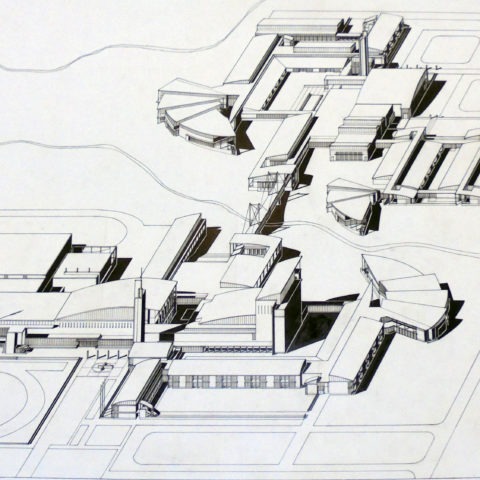
Campus Axonometric Map

This sketch shows the breadth of academic and recreational spaces on the Perry campus, as well as the varying densities and heights of each structure. In a bold black-and-white hand, the amp exaggerates highlights and shadows of the architecture’s bold geometry, creating an informative as well as artful drawing for the client.

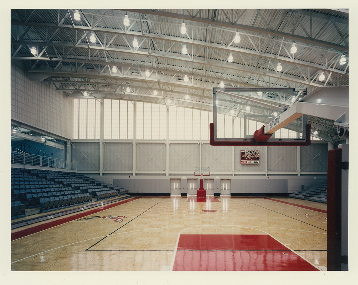
Gymnasium

The interior photograph of the new gymnasium emphasizes the asymmetrical roof design, part of a series of intersecting triangular rooflines in the campus plan. Beneath the roof is a generous clerestory window wall, letting in abundant natural light for games, pep rallies, and other large school gatherings.

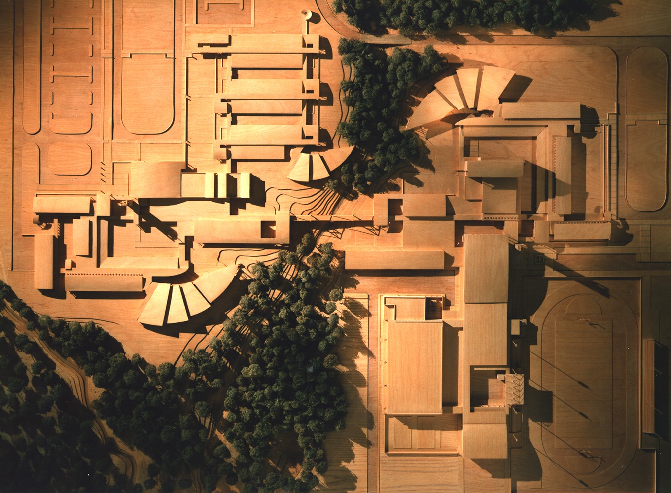
Wood Cut Model

This unique architectural wood model displays an aerial viewpoint of the entire educational village. It pays special homage to the variety of interesting rooflines and shapes that give the campus texture. The model was hand-cut by designers in our Chicago studio.

Campus Plan

This black and white drawing, rendered in pen and watercolor ink, shows the rough, gestural layout of the site. It indicates waterways, athletic fields, and woodlands, as well as impervious surfaces like sidewalks and parking lots.

Reopening Welcome Packet

When the new campus was completed, Perry High School distributed these branded welcome folders to students and staff, with information about the new spaces, as well as a suite of upcoming events in honor of the groundbreaking. With graphics matching the school’s bold red color and font, these materials emphasize the enthusiasm felt by the school community, and the pride they found in their new campus. There’s even an “I <3 Perry” button included to be pinned on sweaters or bookbags.

Auditorium

Clean, sweeping geometrical rooflines also extend to the massive auditorium space, completed with winged balconies on all three sides, adding a variety of levels for viewing as well as extra seating space. A modern play between warm wood and white-washed steel adds visual variety and a crisp feel to the entire space.

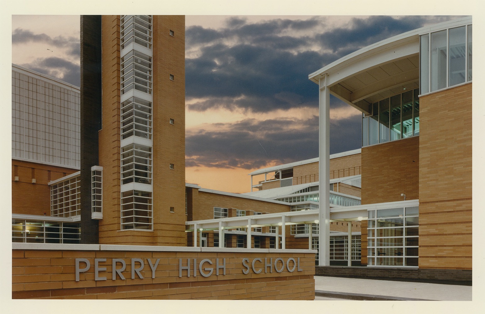
Front Façade

This photograph by Hedrich Blessing shows the front entrance of the school, with the iconic signage and the intersecting layers of brick, whitewashed steel, and glass. The various forms and geometries of each structure create a harmonious composition at the façade.

Main Hall

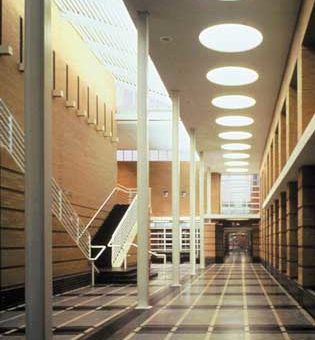
An arterial hallway, this intersection of stairwells connects various classrooms and study spaces at the heart of the building. Though at the center of the project, skylights and double-height ceilings allow light to filter in, giving the hall an atrium-like feel and creating an inviting gathering space for students. Geometry continues to be a source of inspiration here, as large, circular light fixtures dot the height of the corridor.

Process Notes

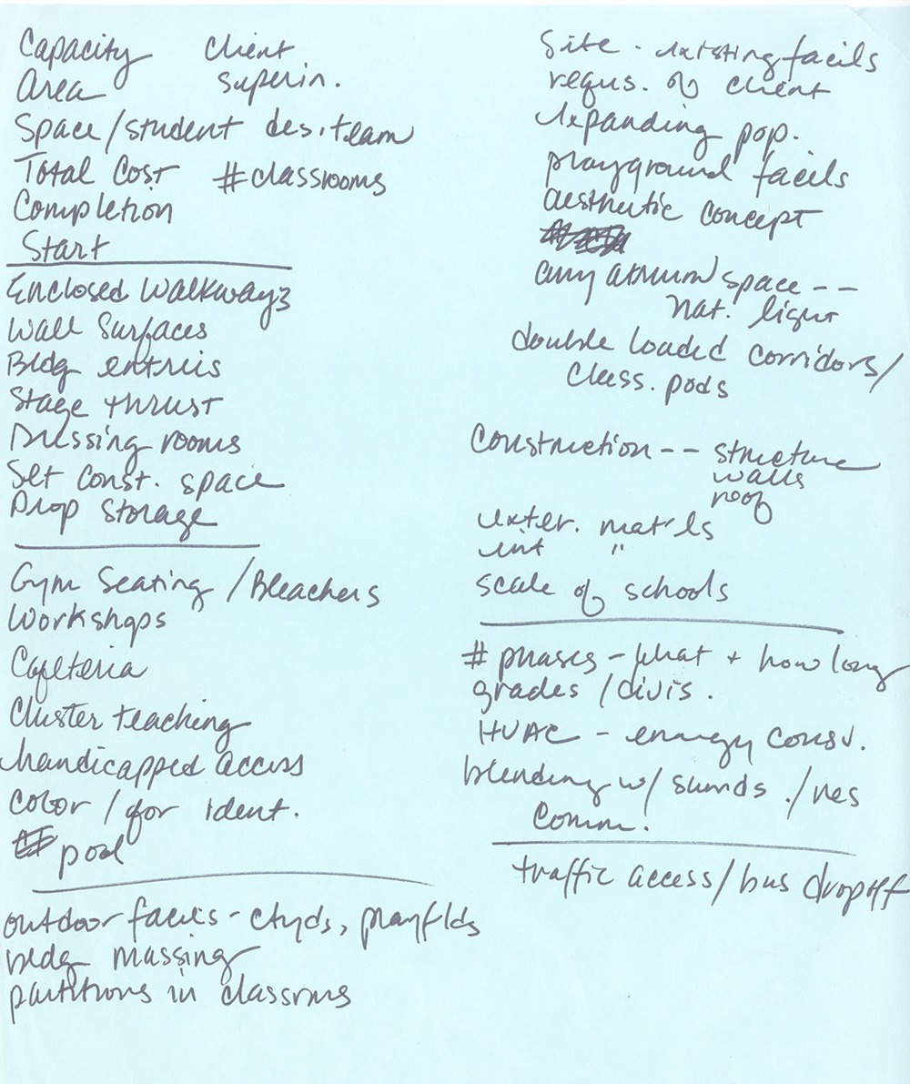
Handwritten notes by the designer, these quick scratches outline the preliminary design process, indicating the priorities both internally and externally to include in the new campus. From traffic flow to theater dressing rooms, these notes show the breadth of architectural thought, and all the diverse activities that school design must take into account.

Annotated Program Study

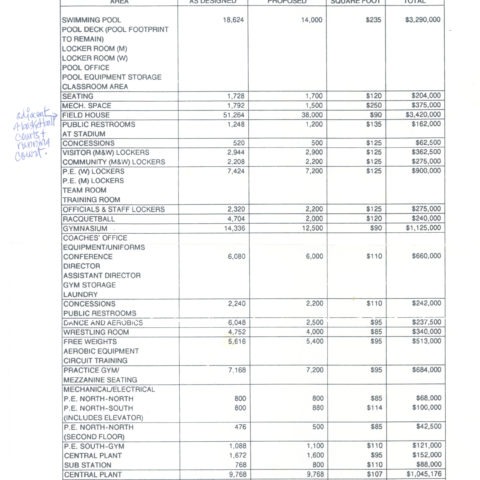
This table, representing the budgeted elements of the architecture, is a time capsule into what it cost to design and build in the ‘90s. Interestingly, the table also shows the threshold of discrepancy between architect and client, indicating “Square footage as designed” vs. “as proposed”

Ralph’s Sketch

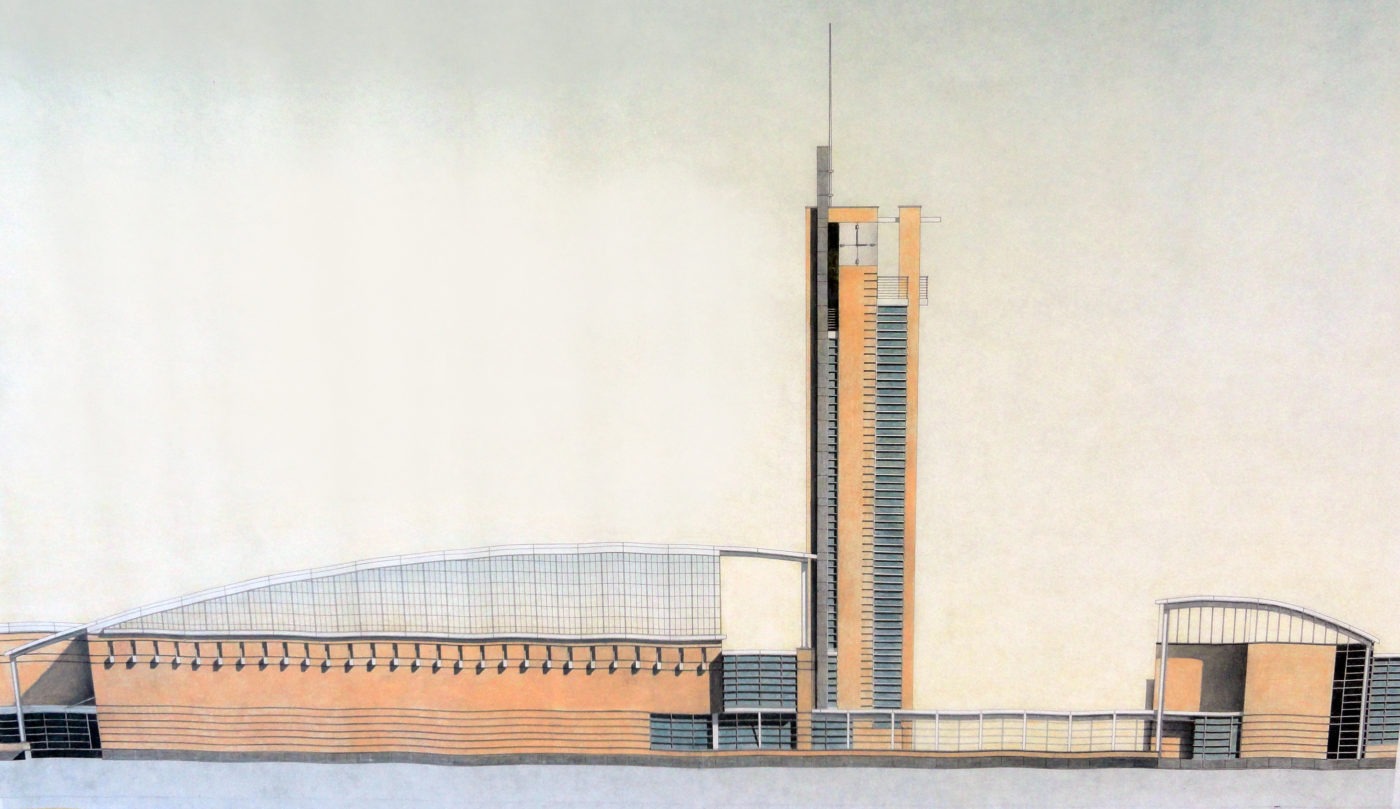
A color-pencil and watercolor drawing by architect Ralph Johnson is an example of the large-scale, hand drawn blueprints and elevations our office rendered for clients in the 90s. Using a drafting table, Johnson meticulously crafted this drawing to showcase his vision for the school’s bold addition, while also highlighting his craft and capability as an architect. The drawing has been beautifully preserved by our Chicago studio.