― Exhibition
A Global Practice: A Campus Plan in Chapingo, Mexico
Completed in 1967, The National Center for Agricultural Education, Research, and Extension was established by the Mexican Ministry of Agriculture to bring together the national agricultural agencies into one institution. Throughout the project, we carefully considered the environmental landscape of Chapingo, Mexico, along with the heritage of the site, including hacienda-style buildings and a chapel with Diego Rivera murals. We used locally sourced stones and maintenance was designed to be minimal. Passive heating and cooling strategies were implemented throughout the new buildings, including sunscreens, canopied courtyards, and orientation to buffer strong seasonal winds. The project marked the beginning of a decades-long relationship between our firm and much of Latin America, and in January 2020, we opened a studio in Monterrey, Mexico.
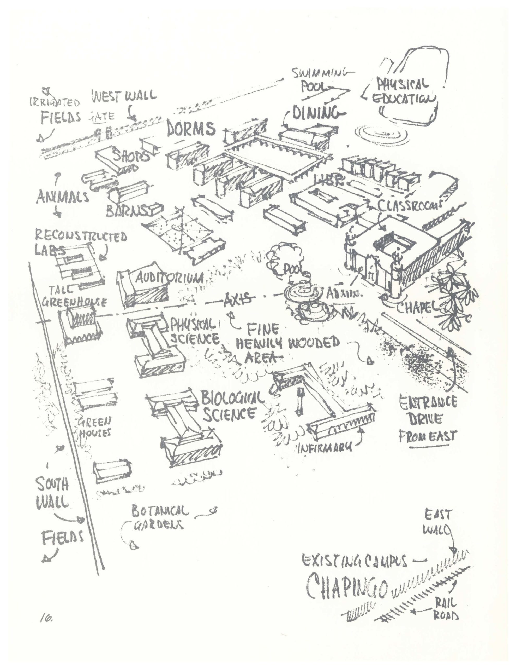
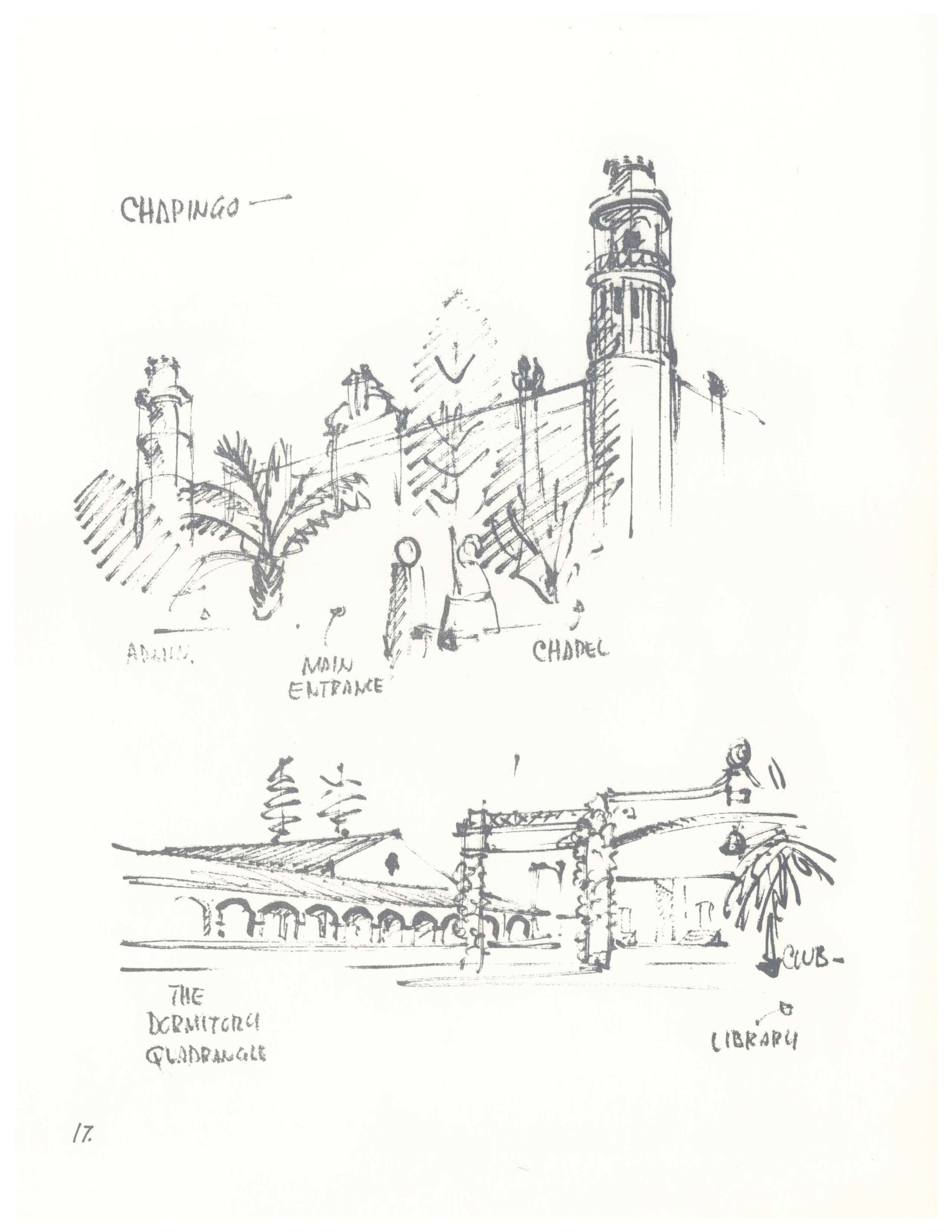
Principal Bill Brubaker, developed a close client relationship with the Ministry of Agriculture, with frequent site visits throughout the life of the project. Greatly inspired by the architectural heritage of the campus and the natural landscape, he captured dozens of hand sketches of the original buildings and surrounding town on his travels.
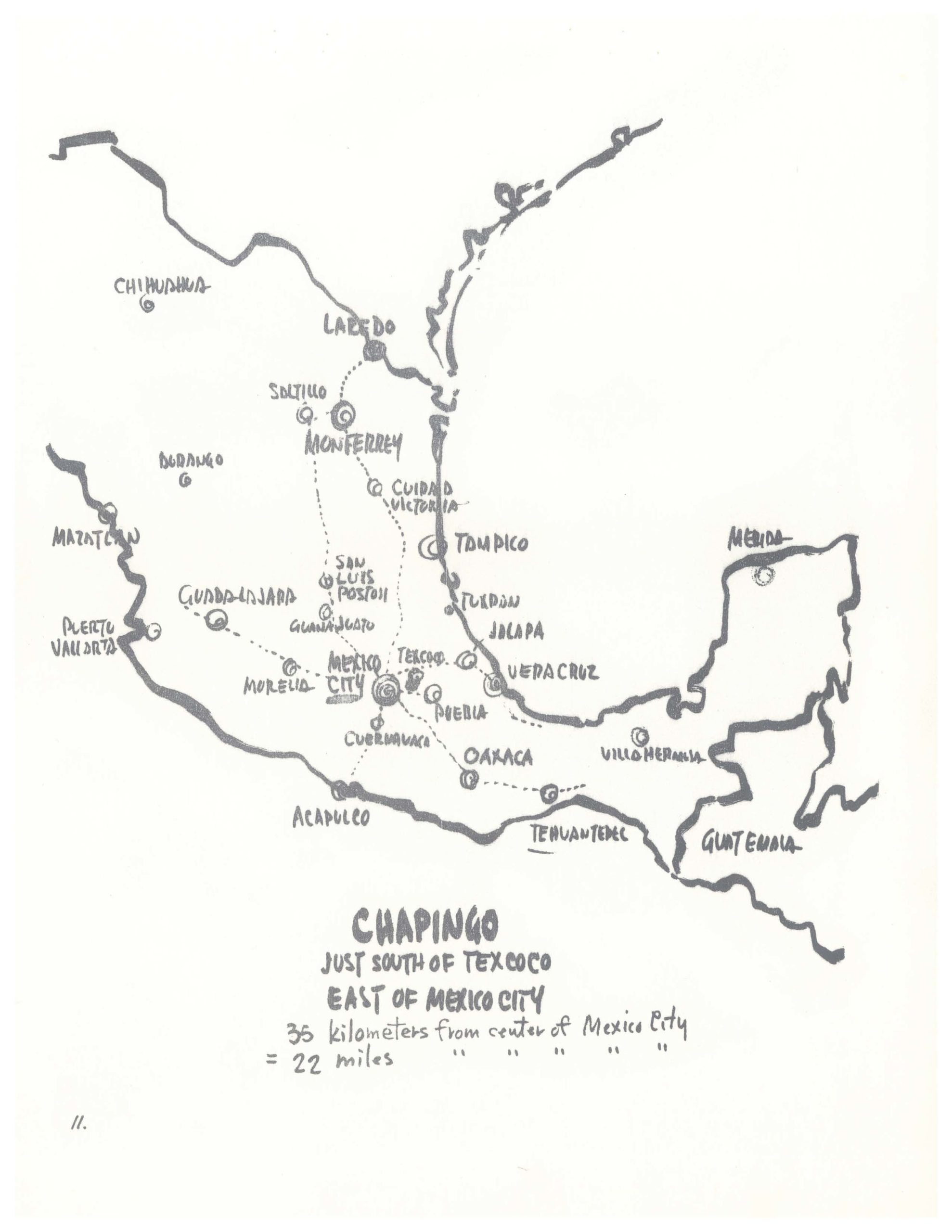
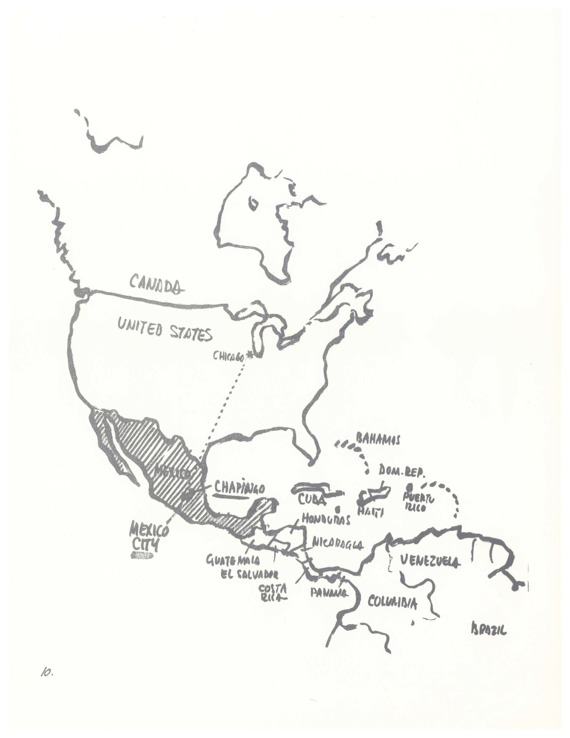
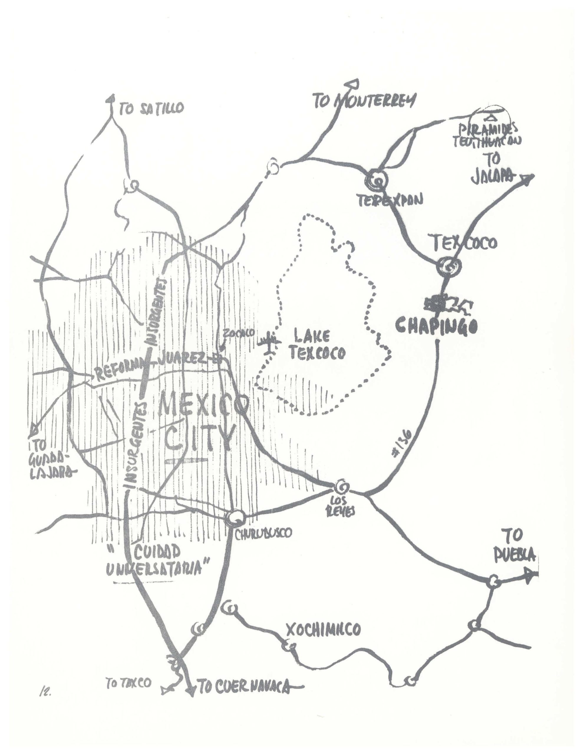
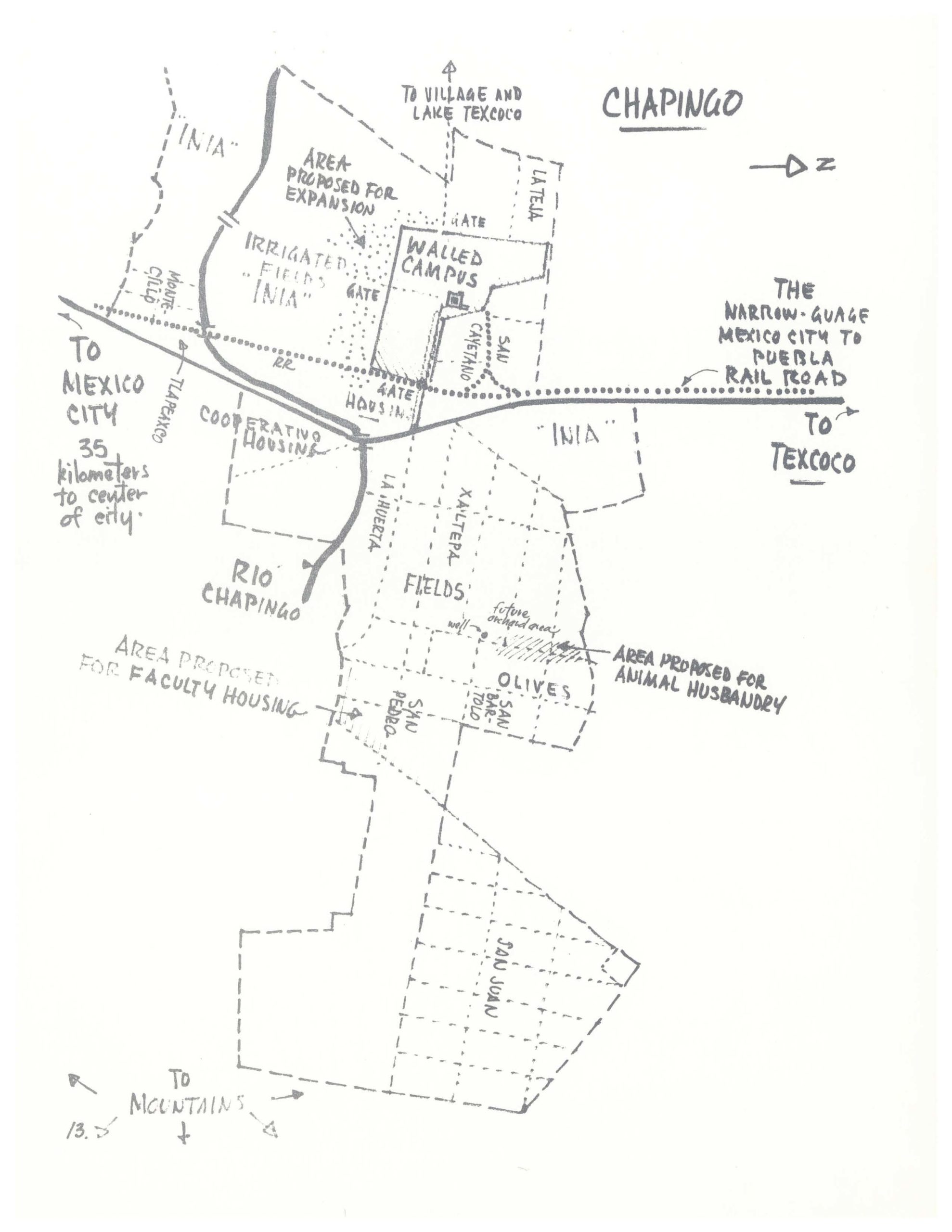

Bill Brubaker’s Chapingo Sketches, 1963
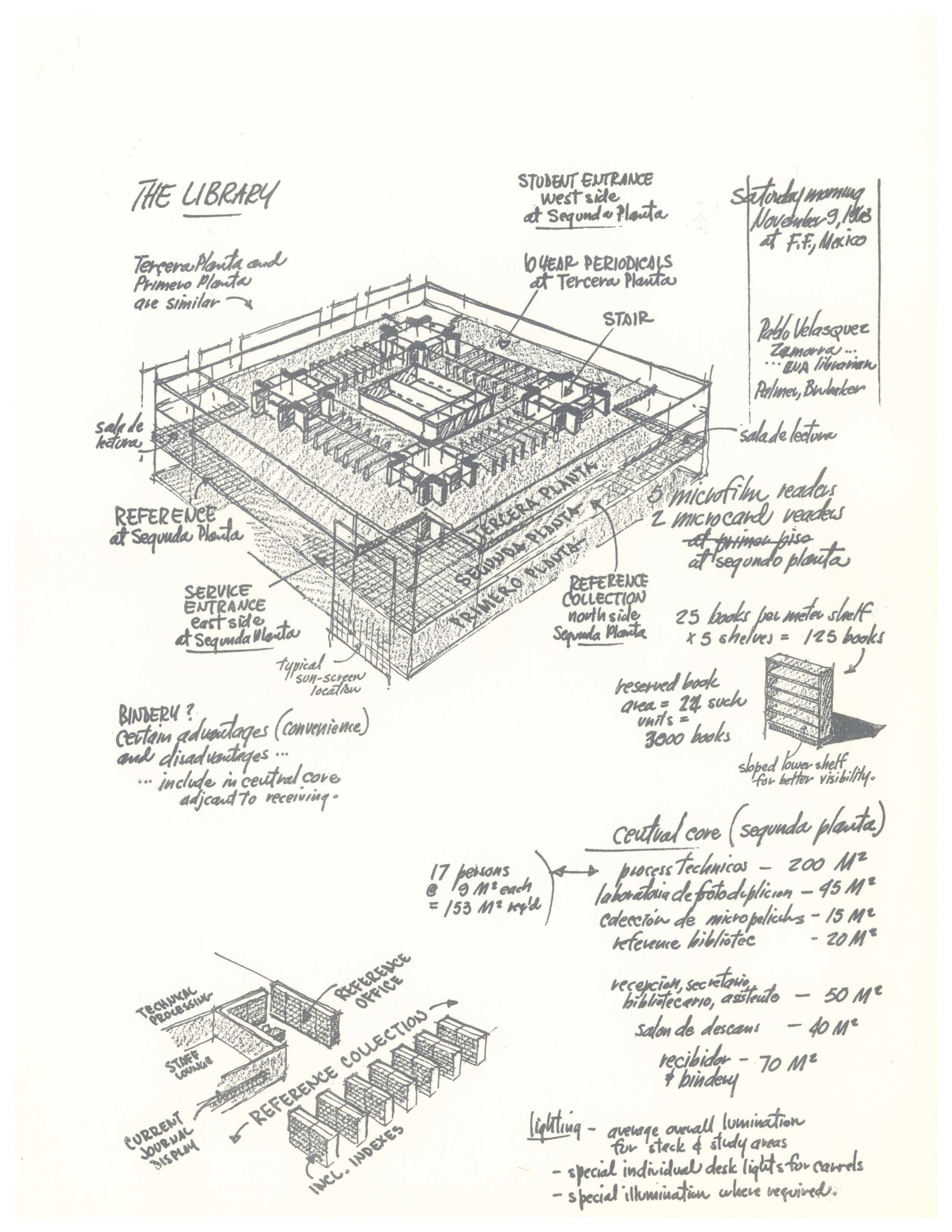
From March 25-29, 1963, architects F. Lee Cochran and Bill Brubaker met with the Ministry of Agriculture to develop the master plan for the new campus. In his trademark, black-marker style, Brubaker captured a scale of contextual drawings, from a map of North America depicting the location of the Chicago Perkins&Will studio in relation to Chapingo, all the way down to a highly detailed dimensional map of the campus and axon drawing of the new library.
Exterior/Façade
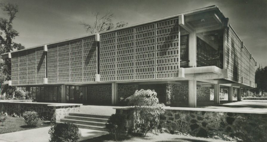
The façade of the university was rectilinear and followed Le Corbusier’s Modernist principle of raising the building off the ground with pilotis, or thin columns that created a shared circulation space beneath the building for courtyards and abstract means of entering and exiting. The most unique feature of this design, though, was the curtain wall façade. While curtain walls had been a staple of Modern skyscraper design, this one was rendered in concrete with mosaic detailing. This feature was what sculpted the dappled lighting within, and offered visual interest to an otherwise glass-encased form.

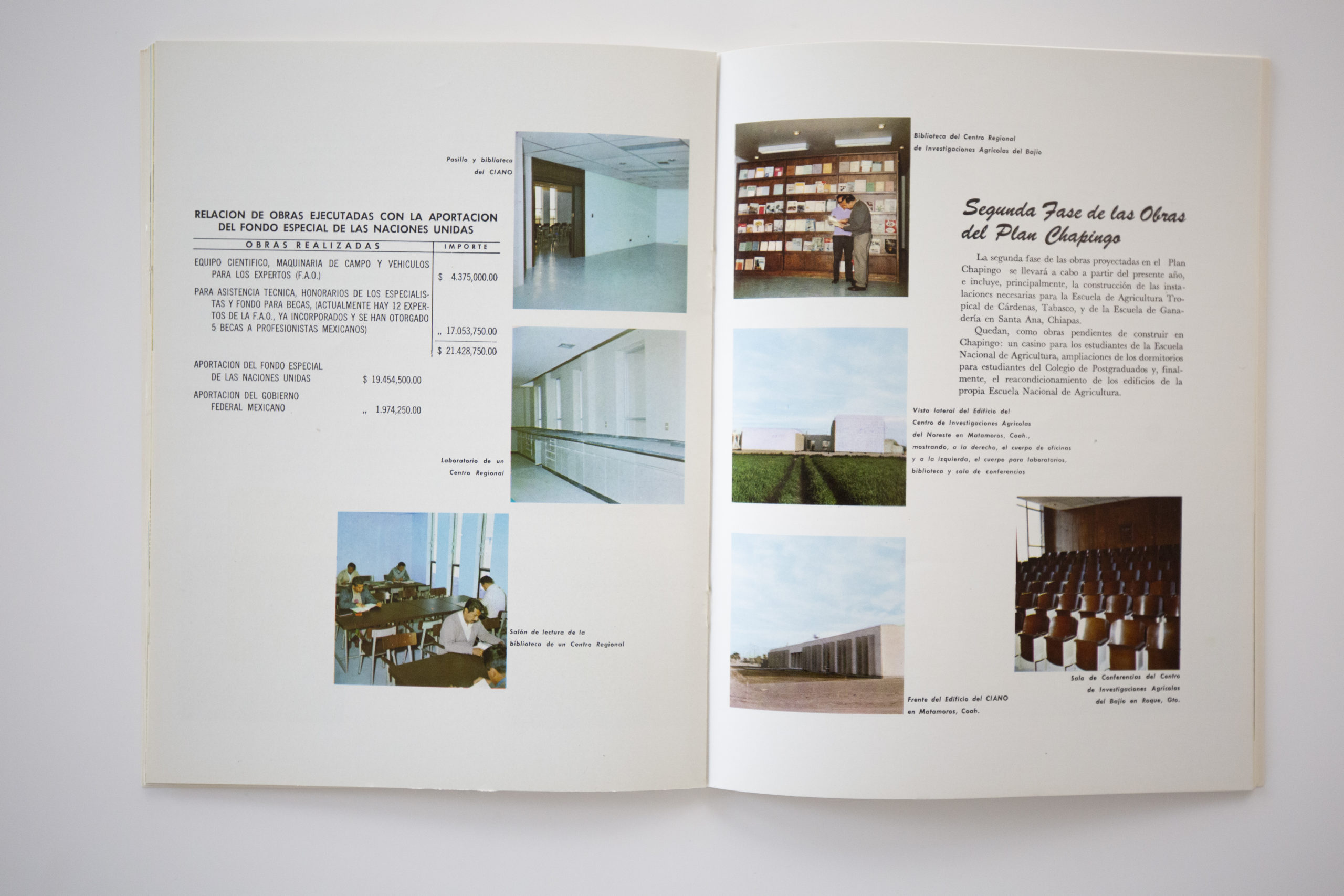
Project Booklet and Spread
An embossed project booklet in Spanish was presented to clients, with customized seals and a modern, sans serif font. The green color choice really makes the booklet stand out as an important yet artful document.
The bifold spread offers a brief verbal description of the campus plan, with the composition dominated by well-spaced color photographs of the interiors of the campus buildings and surrounding landscapes.

The Library
The library space was filled with diffuse light, offering natural daylight for studying students while also set behind a sculptural sunscreen on the façade to keep the interior from overheating in the hot sun. The playful patterns that result add a distinct nonmaterial feature to the entire space, one that changes throughout the day and with the seasons. The designers even went one step further as to align furnishings and décor to mirror the grid-like patterns and geometries, for a cohesive whole.

Pilotis Courtyard Detail
Here, we are able to see beneath the canopy created by the pilotis and the surprises of the covered courtyard they create. A glass spiral staircase acts as an entrance point for the main building, and the raised platform offers an oasis of shade for students to congregate underneath throughout the day.

Site Plan
Overlaid on a grid, the irregular plan of the sloping site was rendered here with attention to where each structure of the campus would stand, as well as where landscape and open green spaces would be located between them. The campus seems closely aligned with Le Corbusier’s “tower in the park” concept, where taller buildings on pilotis were placed in a continuous, park-like landscape. Roads for automobiles were reserved only for the periphery of the property.
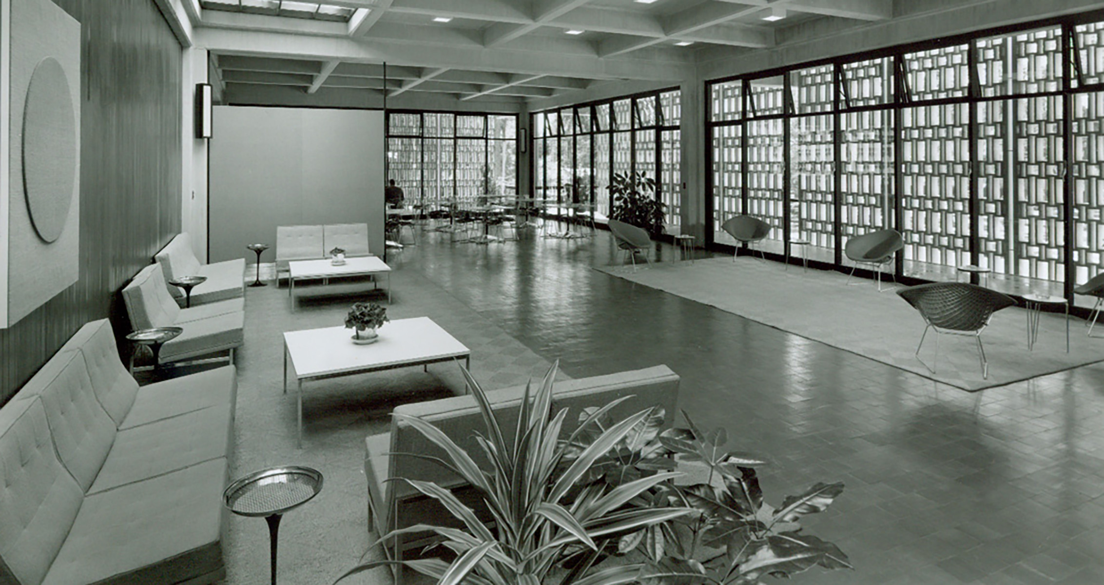
Common Circulation Space
Common areas throughout the campus were characterized by floor to ceiling windows that let in the same patterned diffuse light from the punctured façade envelope, lighting the interiors without the side effect of unpleasant heat. This allowed students to congregate around couches, chairs, and coffee tables all in the Modernist style – minimal detailing and strong geometries rendered in shiny, innovative materials to reflect a crisp, uncluttered interior design. Plants and wood accents added a warmth to the composition.
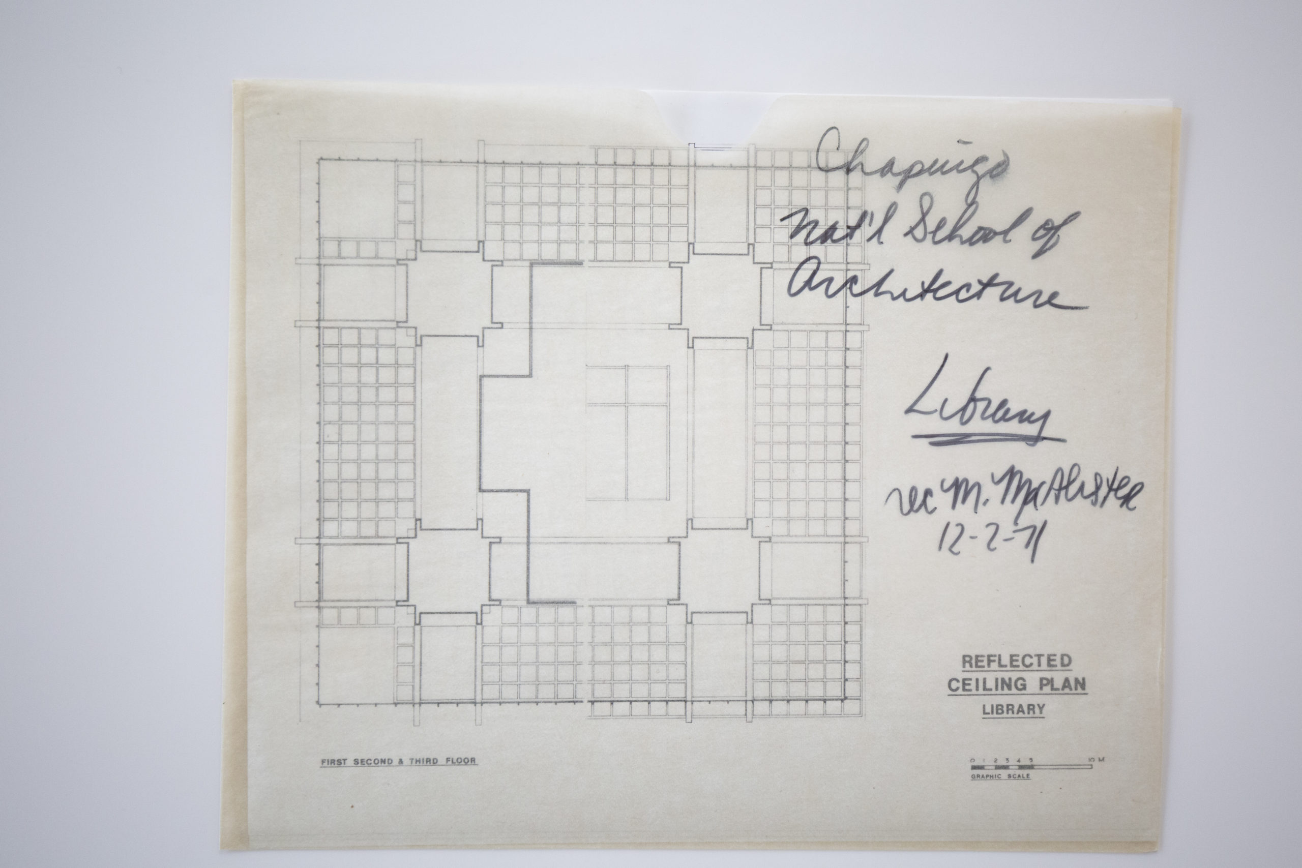
Plan of the Library
In this meticulously scaled ceiling plan, we can see the geometric basis of all the design work, from the stacks to study spaces. One of the most intriguing details is the symmetry in the intersectional spaces, where two hallways converge under a perfectly square ceiling, complete with marks delineating molding detail. The plan is an art piece in its own right—as beautiful as it was practical for the builders and designers at the time.
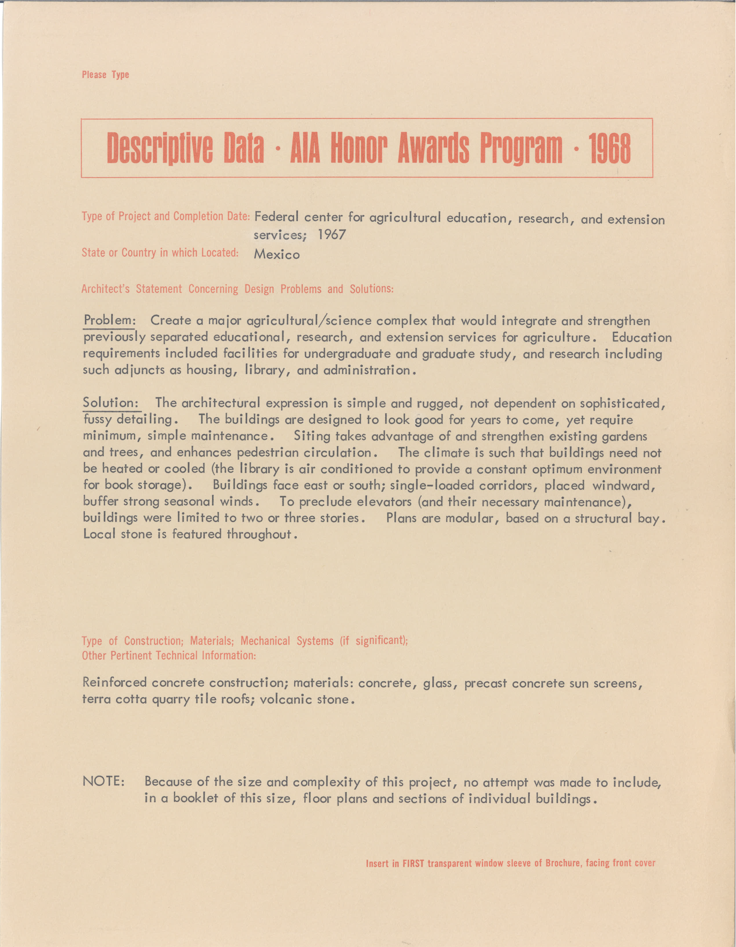
AIA Award Statement, 1968
In 1968, the AIA recognized our project with an award and included a statement by our designers in their annual publication, detailing the creative solutions that resulted from the design.